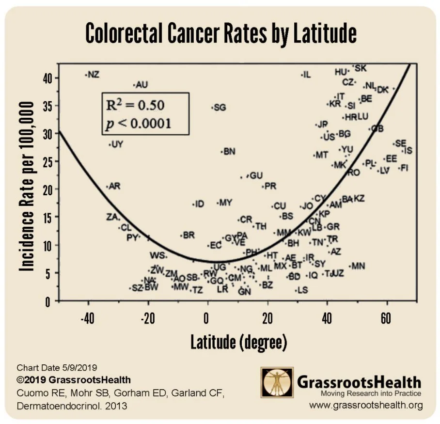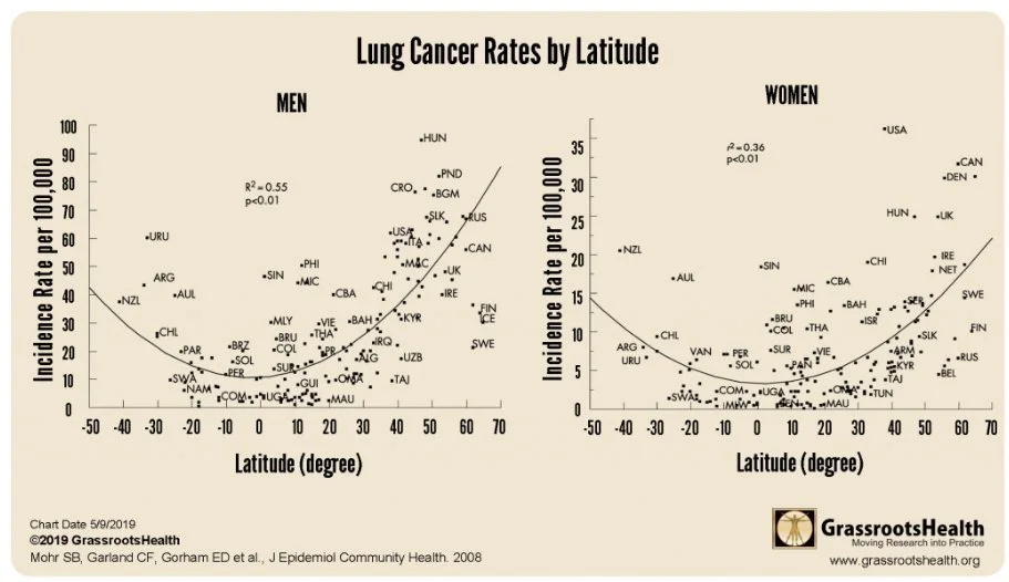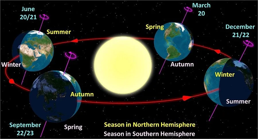
The sun’s rays are strongest at the equator
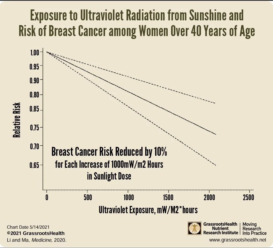
UV and blue light are immune suppressing
Red and Infrared light are immune strengthening
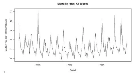
In winter there is less light that correlates with more disease and death. This is reverse for summer
Cancer and autoimmune disorders are less at the equator
Sunlight Prevents Disease
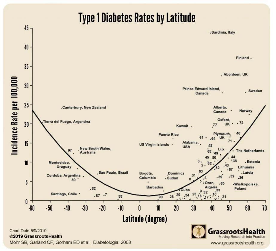
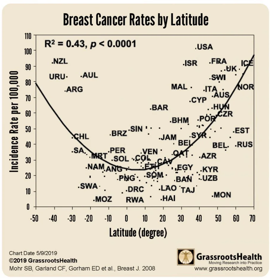
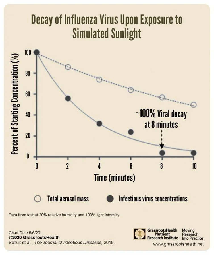
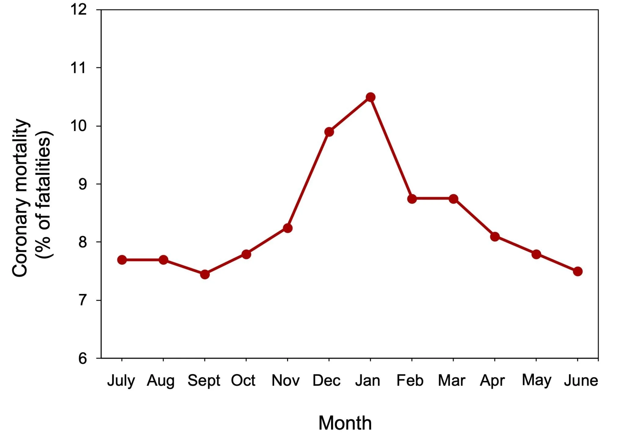
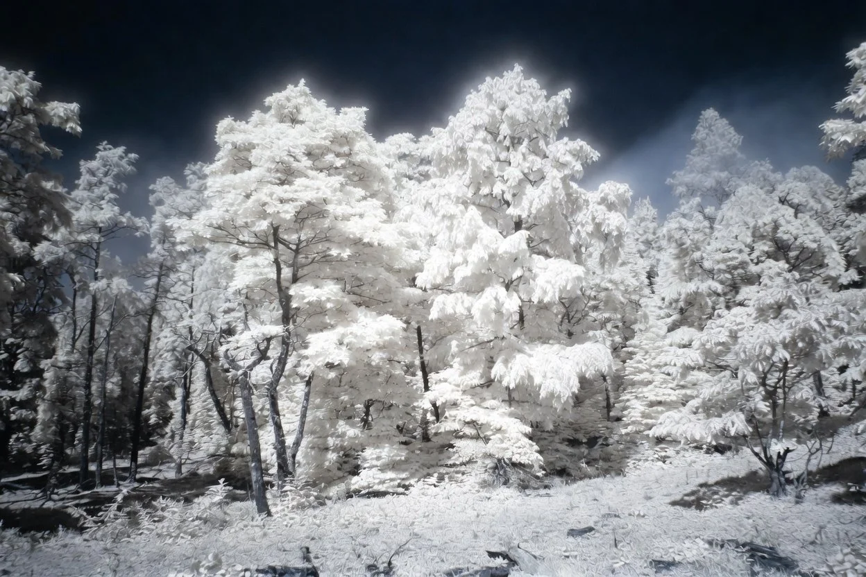
Image of Ultraviolet Light emitted by trees and plants appears as white snow when taken with a infrared camera.